HSBC Create
A new portal to house and improve HSBC's global design standards

Situation
HSBCs design standards were disjointed and not easily accessible. Important assets and useful information were buried within intranets or on personal computers. This meant some projects external and internal design projects were not getting the best guidance. As a result sub-optimal design work was being created and launched.
Project goal
To create a centralised hub, showcasing HSBC’s best in class design standards. Giving the design community timely access to guidance and relevant artifacts to help with their workflows.
Designs
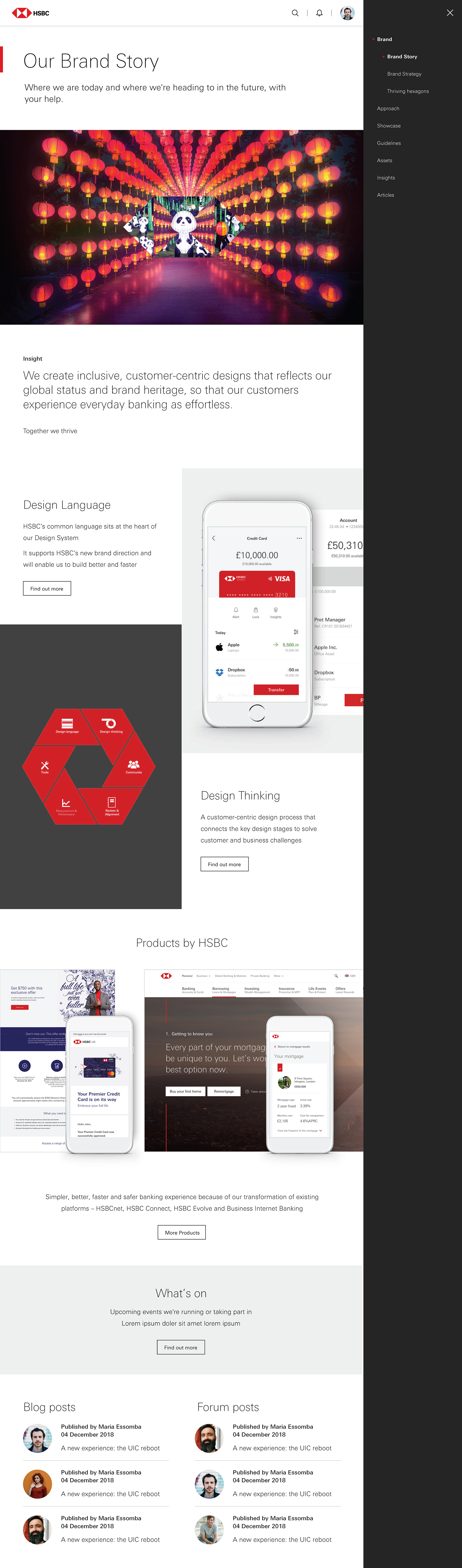
Homepage design
Responsive Homepage Design: Developed fully responsive layouts adapting seamlessly across devices
Core Purpose: Serving as an inspirational landing point and brand gateway
Brand Showcase: Elegant digital application highlighting HSBC's visual identity standards
Design Elements: Clean typography paired with bold, large, high quality brand imagery.
Functionality: Combines inspiration with practical access to brand resources and standards
Design Ethos: Balances professional financial industry standards with contemporary digital aesthetics

Hub page
Mobile-First Design: Prioritized intuitive navigation optimized for mobile devices
Brand Window: Interface serves as a comprehensive portal into HSBC's brand ecosystem
Quick Asset Access: Streamlined pathways to specific design assets and guidelines
Thought Leadership: Integration of brand philosophy and strategic insights
Best Practice Examples: Showcase of exemplary brand implementations
User-Centered Navigation: Intuitive information architecture enhancing discoverability
Resource Integration: Seamless access to both practical tools and inspirational content
Design Efficiency: Optimized workflows for designers and brand users
Streamlined Component Access: Quick pathways to component files on guidance pages
Transparent Change Management: Clear change logs documenting updates and modifications
Version Control System: Comprehensive tracking of component iterations and releases
Contributor Recognition: Visible attribution to team members involved in each component
Uniform Content Structure: Consistent layout across all guideline pages for improved navigation
Design Principle Documentation: Clear articulation of foundational design philosophies
Usage Guidelines: Practical application instructions for each component
Component Anatomy Breakdowns: Detailed visual deconstructions of design elements
Variation Documentation: Comprehensive catalogs of component variants and options
Behavior Specifications: Clear guidance on interactive elements and states
Collaborative Environment: Features fostering community engagement and feedback
Knowledge Sharing Framework: Tools supporting collective understanding of design elements
Progressive Development: Systems encouraging continuous improvement of guidelines
Community Building: Infrastructure to connect designers and implementers across the organization
Guidelines detail page
